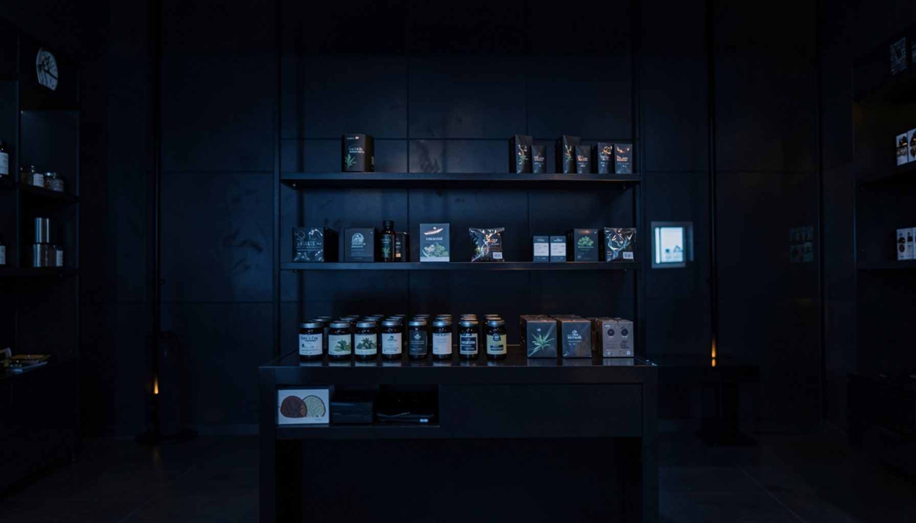
The evolution of product packaging at Jeeters Juice Shop
The conversation around cannabis retail rarely starts with cardboard and cellophane, yet the wrapping and labelling of every jar or pre-roll tube tells the story of a maturing industry. In markets where adult-use cannabis has moved out of the shadows, packaging has become the meeting point between regulator and consumer. Jeeters Juice Shop has built its identity through that meeting point, turning ordinary containers into objects collectors want to keep.
Founded as a curated online retailer, the brand has always treated packaging as more than a transit vessel. Each line of pre-rolls, vape cartridges, liquid diamonds, live resin, and flower carries its own visual register, signalling strain profile, potency range, and intended effect before the lid is opened. This approach helps the company differentiate inside crowded catalogues distributed across California, Arizona, and Michigan while staying accessible for newcomers.
Australians exploring overseas dispensaries through digital press coverage have followed this packaging story with curiosity. The Therapeutic Goods Administration and state regulators have pushed Australian cannabis packaging into a strict lane, with rules about child resistance, plain packaging elements, and medical disclaimers. Watching how an American retailer handles branding inside looser guardrails offers a useful counterpoint for local producers balancing compliance with personality.
What follows is a look at the design choices, material shifts, and cultural cues that have shaped how Jeeters Juice Shop presents its lineup. From foil pouches to branded apparel boxes, every generation of packaging reflects a slightly different answer to the same question — how do you make a regulated product feel like a lifestyle object without losing authenticity or trust.
Early mylar pouches and the seed of a visual identity
In the brand's earliest era, priorities were simple: keep the product fresh, lock in aroma, and signal potency through colour. Mylar pouches with heat-sealed edges became the workhorse, paired with single-colour stickers listing THC percentages, terpenes, and a hand-drawn strain name. The aesthetic leaned into a skate-shop grit of blacks, neons, and oversized type that read well on a phone camera, resonating with younger adults already collecting strain-specific drops.
Strain names carried personality the packaging art sometimes couldn't. A tube identical to its shelf-mate could become collectable because of what was printed on its label. Early adopters in Sydney and Melbourne often saw these designs through friends travelling overseas, screenshots in group chats, and importer forums where enthusiasts traded unboxing photos. The packaging became a quiet passport, hinting at varieties Australian patients could only access through Special Access pathways.
Australia's packaging conventions formed in parallel. Local producers learned that a hermetic seal, moisture-balancing liner, and tamper-evident closure were the baseline. Watching how international brands layered storytelling on top of those essentials gave local designers a benchmark. Even when Australian rules demanded plainer finishes, lessons about typography and limited-edition colourways stuck, planting the seed for everything Jeeters would later attempt.
Material upgrades and the move toward sustainable construction
The leap from basic mylar to engineered tubes, glass jars, and rigid paperboard happened gradually. As regulators and buyers demanded better tamper evidence, brands invested in certified child-resistant closures and rigid shell containers. Jeeters Juice Shop embraced that push early, rotating in heavier gauge tubes and foam-lined tins for premium offerings. The shift gave products weight in the hand, a tactile cue cheaper packaging could not replicate.
Sustainability has become a quiet but persistent theme. Where once every pre-roll arrived in a plastic sleeve, modern iterations rely on recycled paper overwraps, plant-based inks, and minimal adhesives. Consumers in Brisbane and Perth, where independent dispensaries publish their environmental policies, notice these details. Packaging that used to feel disposable now competes with refillable jars, compostable wraps, and QR codes linking to brand hubs documenting sourcing and lab testing practices, including through retailers such as Aspeth.
Supply chain realities shape those decisions as much as consumer pressure. Glass prices climbed, aluminium tariffs wavered, and pulp mills consolidated. Jeeters has responded by standardising on a smaller core set of formats, then riffing on colour and finish rather than chasing different shapes for each line. That discipline keeps production costs manageable and allows limited drops without retooling the pipeline.
Typography, texture, and a cohesive brand voice
A close look at any current Jeeters Juice Shop shelf shows typography doing as much work as illustration. The brand has settled on a confident sans-serif hierarchy for strain names, paired with a script flourish on heritage cultivars and a condensed display face for limited releases. This three-tier system lets the same template shift personality depending on what fills it, producing a catalogue that feels related without being repetitive.
Texture plays a supporting role. Soft-touch matte coatings on outer cartons, glossy spot varnish on logos, and subtle debossed emblems on premium SKUs create a layered surface that holds light differently depending on the angle. These finishes feel almost ceremonial in the hand, nudging the product toward a small ritual. For enthusiasts documenting sessions on social channels, that visual depth photographs beautifully, and unboxing content has become a free marketing layer retailers can lean on.
Colour coding has matured in tandem. Sativa-leaning strains lean brighter and warmer, indica options drift toward deeper purples and blacks, and hybrids sit in green and teal mid-tones. Customers learn the code quickly, sometimes faster than they read printed THC ranges. In Australia, where medicinal labels demand clinical accuracy, this visual shorthand is harder to apply directly, but local brands borrow the convention for patient leaflets and loyalty materials.
Labelling accuracy and the push toward transparency
Every step in Jeeters' packaging evolution has coincided with sharper labelling standards. The brand prints batch numbers, harvest dates, and full terpene panels directly on containers, often alongside a scannable code resolving to a third-party certificate of analysis. That transparency used to feel like overkill in a recreational market; now it reads as standard practice. Consumers expect to verify what they have purchased, and a package hiding details loses credibility fast.
The same instinct has reshaped compliance notes. Dense blocks of legal copy buried in grey print are gone. Today's layouts reserve clean white space for warnings, dosing guidance, and allergen callouts, while brand identity holds the rest of the surface. This split feels familiar to anyone handling pharmaceutical packaging in Sydney hospital supply chains, where clarity and brand recognition must coexist. Jeeters has studied that playbook and adapted it for a more lifestyle-leaning audience.
Labelling innovation also extends to tactile accessibility. Raised markings on select SKUs, high-contrast icon sets for colour-blind users, and fold-out leaflets in multiple languages quietly expand who can comfortably read a package. Australian accessibility advocates have pushed similar standards locally, and cross-pollination continues to push the industry toward packaging that informs rather than decorates.
Premium pre-rolls and signature collections
Nowhere has Jeeters' packaging evolution played out more visibly than in its pre-roll category. Early tubes were unbranded cylinders with simple caps; current flagship designs are layered tubes with magnetic closures, embossed strain crests, and colour-matched inner sleeves. Curated multi-pack collections have become shelf centrepieces, with outer cartons doubling as display trays in dispensary cases. Customers in Adelaide who follow U.S. cannabis press see these SKUs featured in retailer hauls long before any clear customs.
The Baby Cannon format shows how packaging can change the perceived value of a familiar product. A larger infused pre-roll gets treated less like a single serving and more like a small event product, with the outer wrap acknowledging that shift in tone. Limited collabs lean even harder into collectability, using numbered sleeves, signed inner stickers, and short print runs that turn packaging into the entire reason for the release.
Liquid diamonds and live resin categories follow a similar trajectory. Syringes live in foam-cut inserts inside hard-shell cases, droppers wear tamper-evident neckbands, and dabbable formats come in jars matching the broader pre-roll colour story. The logic is consistent across categories: the more ritualised the consumption method, the more elevated the packaging. Australian medical producers are absorbing this principle as they move from bulk tubs to user-friendly formats.
Limited drops, apparel, and the collectible box
Packaging in the modern era is about the moment as much as the product. Limited drops at Jeeters Juice Shop routinely sell out within hours, and the unboxing experience carries much of that urgency. Branded apparel boxes, numbered outer sleeves, and matching sticker sheets turn a single purchase into a small memorabilia kit. The strategy mirrors what streetwear labels in Melbourne's inner north have done with sneakers and graphic tees, making the box itself a desirable object.
Apparel collaborations bring their own packaging logic. Hoodies, tees, and hats ship in reusable dust bags and printed mailers, often with a matching strain or product tie-in. That cross-category consistency means a customer buying a pre-roll might store the leftover tube inside a folded apparel bag, an organic brand-ecosystem effect no single product could create. Australian streetwear culture, which treats graphic labels as wearable art, understands this dynamic implicitly.
For customers chasing the brand at its most experimental, seasonal mailers and numbered release cards double down on the collectible angle. Some are explicitly designed to be kept, with archival paper stocks and minimal ink coverage. Others lean into minimalism, presenting the product almost naked inside a thick paperboard frame. The variety keeps collectors returning, because no two drops repeat the same formula. Readers curious about which strains anchor these limited releases will recognise the same heritage varieties explored in this guide on cult classic strains.
The road ahead for cannabis packaging
The next phase of Jeeters' packaging story will likely focus on smarter interactivity. NFC chips embedded in lids, dynamic QR codes tied to live batch data, and AR-enabled labels launching strain walkthroughs on a phone are all within reach. As prices for embedded electronics fall, even mid-tier SKUs could ship with packaging that talks directly to the buyer, replacing the static paper insert with a living product page.
Regulatory tightening will continue to nudge design choices in the background. Whether products are sold in California or shipped through discreet international forwarding, the brand must anticipate stricter child-resistance tests, more granular terpene disclosures, and increasingly specific environmental reporting. Designers who preserve the brand's lifestyle feel while threading through compliance will define the next generation of cannabis retail.
Customers who want to see how those decisions translate into finished products can browse the current lineup directly, where updated tubes, jars, and apparel boxes reflect every generation of choices outlined above. The shelf is small, but each item carries the lessons of every previous release — a quiet record of how a regulated product learned to dress itself.